User login
Discharge Appointments
Dicharge of a patient from the hospital is a complicated, interprofessional endeavor.1, 2 Several institutions report that discharge is one of the least satisfying elements of the patient's hospital experience.35 Recent evidence suggests that a poorly planned or disorganized discharge may compromise patient safety in the period soon after dismissal.6 Several initiatives have been aimed at improving patient satisfaction and safety related to discharge.710
In 2000 the Mayo Clinic (Rochester, Minnesota) Department of Internal Medicine leadership established a goal to improve patient satisfaction with the hospital dismissal process. Patient focus group data suggested that uncertainty about the anticipated date and time of discharge causes frustration to some patients and families.
We hypothesized that an appointment to leave the hospital might be practicable. We joined an Institute for Healthcare Improvement collaborative (Improving Flow Through Acute Care Settings, 1 of 6 Improvement Action Network [IMPACT] Learning and Innovation Communities) aimed at scheduling discharge appointments (DAs). The collaborating members deemed that, although the ideal DA is set at least a day in advance, a same‐day DA is also desirable for both patient satisfaction and staff task organization in pursuit of a high‐quality discharge.
METHODS
This project was approved by the Mayo Foundation Institutional Review Board. We tested the following hypotheses:
It is possible to make and display DAs in various care units.
Most DAs can be scheduled a day before dismissal.
Most DA patients depart on time.
Setting
Mayo Clinic in Rochester, Minnesota, is a tertiary academic medical center with 2 hospitals (Saint Marys and Rochester Methodist) that house a total of 1951 licensed beds in 76 care units.
The preliminary study displaying DAs was carried out in the Innovation and Quality (IQ) Unit of Saint Marys Hospital, a 23‐bed general medical care unit that supports both resident and nonresident services. Traditionally, primary services usually consist of an attending physician and house officer physicians (junior and senior residents). Less commonly, primary services consist of an attending physician and either a nurse‐practitioner or a physician assistant.
The design pilot took place between August 2 and December 24, 2003. The subsequent, larger study of applicability took place across 8 care units (including the IQ Unit) between December 28, 2003, and April 25, 2004.
Preliminary Work: Design Pilot
We designed bedside dry‐erase wall displays and mounted them in the rooms in plain view of patients and their families and caregivers. Pilot testing of DA scheduling was done on a general medical care unit from August 2 to December 24, 2003. To optimize the process for scheduling a DA, our team developed 21 small tests to change the dismissal process through plan, do, study, and act cycles.11
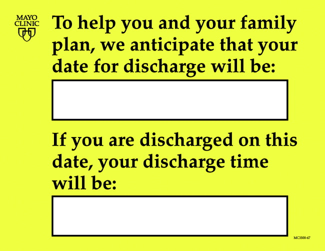
The recommended process was that as soon as an organized discharge could be reasonably envisioned, the primary service provider would discuss with the patient, family, and primary nurse (and a social service worker, if involved) the anticipated discharge day. A member of the primary service was to handwrite (with a marker) the anticipated day on the specially designed bedside dry‐erase board (Fig. 1) in view of the patient. The same primary service prescribers could amend this anticipated day (or time) by repeating the process of consultation and discussion as needed. The time of the DA could be written on the DA board (or amended) by either a member of the primary service or the primary care nurse.

Each morning, the primary care nurse transmitted the DA board data to the admission, discharge, and transfer log kept at the unit secretary desk (in which the actual discharge time has always been routinely recorded by the unit secretary).
Adoption of DA Scheduling in Other Care Units
Several meetings were held with 7 other patient care unit leaders about adopting the protocol. These units, both medical and surgical, were selected according to 3 criteria: (1) prior participation in unit‐level continuous improvement work, (2) current or recent work in any aspect of the discharge process, and (3) a reputation for having innovative nursing leadership and staff.
Data Acquisition and Analysis
Data were collected daily from each participating unit's admission, discharge, and transfer log: both the actual time of departure and the DA, if one had been scheduled. For each DA patient, the DA time was compared with the actual departure time.
RESULTS
During the 4‐month study of discharges across 8 care units, 1256 of 2046 patients (61%) received a DA; 576 of the DAs (46%) were scheduled at least 1 day in advance (Table 1). Among patients with a DA, 752 were discharged on time (60%), and only 240 (19%) were tardy.
| Unit | DAs | Departure time of patients compared with DA | |||||
|---|---|---|---|---|---|---|---|
| No. | Type of unit | No. of patients | Patients with DAs, n (%) | DAs scheduled ϵ 1 day ahead, n (%) | On time, n (%)a | Early, n (%) | Late, n (%) |
| |||||||
| 1 | Neurology/neurosurgery | 525 | 270 (51) | 0 (0) | 175 (65) | 44 (16) | 51 (19) |
| 2 | Surgery (mixed) | 481 | 325 (68) | 289 (89) | 166 (51) | 101 (31) | 58 (18) |
| 3 | General internal medicine (IQ Unit) | 466 | 243 (52) | 35 (14) | 132 (54) | 50 (21) | 61 (25) |
| 4 | Neurology/neurosurgery | 267 | 189 (71) | 40 (21) | 119 (63) | 41 (22) | 29 (15) |
| 5 | Vascular surgery | 201 | 127 (63) | 127 (100) | 90 (71) | 12 (9) | 25 (20) |
| 6 | Psychiatry | 46 | 42 (91) | 42 (100) | 28 (67) | 9 (21) | 5 (12) |
| 7 | Orthopedic surgeryelective | 38 | 38 (100) | 22 (58) | 24 (63) | 3 (8) | 11 (29) |
| 8 | Orthopedic surgerytrauma | 22 | 22 (100) | 21 (95) | 18 (82) | 4 (18) | 0 (0) |
| Total | 2046 | 1256 (61) | 576 (46) | 752 (60) | 264 (21) | 240 (19) | |
DISCUSSION
In response to patient focus group feedback, we designed a tool and a process by which a DA could be made and posted at bedside. Among 2046 patients discharged from 8 care units over 4 months, 61% (1256) had a posted, in‐room DA. Almost half the patients with DAs (46%) had a DA scheduled at least 1 calendar day ahead. Remarkably, among patients with a DA, fewer than 20% were discharged tardily. In‐room posting of DAs across a spectrum of care units appears to be practicable, even in the face of extant diagnostic or therapeutic uncertainty.
This was an initial test‐of‐concept project and an exploratory trial. The limitations are: (1) satisfaction (patient, family, nurse, and physician) was not tested with any validated survey instrument, (2) length of stay was not studied, (3) reasons for variable DA success among care units were not ascertained, and (4) resource use was not measured.
Anecdotal information from a postdischarge phone survey indicated that patients seemed appreciative of a DA. The survey data were not included in this article because the survey tool was not a validated instrument and the interviewer (a coauthor) was not blinded to the hypothesis and was therefore subject to bias. No negative comments were received through informal real‐time feedback from patients and family during the making and posting of DAs, and encouraging comments were common.
Physician participation in posting the DA appeared to be key, and the unavoidable dialogue about the clinical rationale for a chosen date seemed welcome. A telling anecdote came from a patient who did not have a DA board: I didn't get the same treatment as my roommate with the [DA] board. The other doctors talked with [him] more about discharge. I wish my team would have done this more with me.
We cannot be certain of the reasons for the care unit disparity in setting and meeting DAs. We speculate that the level of staff enthusiasm for DAs explains the variation rather than patient population characteristics. Further, we cannot explain why 39% of the patients did not receive a DA. Physician feedback was generally, but not uniformly, positive. Negative comments that might explain DA omissions include: (1) patients already are informed and awarethe tool is superfluous; (2) the day of discharge is unknowable in advance; and (3) patients or family members will hold us to it or be upset if the DA is changed.
We expected that diagnostic uncertainty might pose challenges to providing DAs. When primary service providers were reassured that DAs could be amended, this concern was reduced (but not eliminated). It seemed useful for providers to envision the earliest day of discharge by assuming that the results of a pending key test or consultation would be favorable. Frequency of DA modification was not studied. DAs were amended, however, and patients (to our knowledge) seemed unperturbedperhaps because of an almost unavoidable discussion of the clinical rationale because the act of posting the DA occurred in full view of (and in partnership with) the patient.
A trend toward discharge earlier in the day was observed (data not shown). Theoretically, such a trend offers the potential to improve inpatient flow, in part by discharging patients before morning surgical cases are completed.
Although we had many favorable comments about DAs from patients, family members, and nurses, satisfaction of patients, families, and staff members deserves formal study. Further, it is not known whether unused DA boards might contribute to patient dissatisfaction. Any effect that the display of DAs may have on the length of stay also may be a topic worthy of future study.
CONCLUSIONS
Patients and their families sometimes desire more communication about the anticipated day and time of hospital discharge. We designed a process for making a tentative DA and a tool by which the DA could be posted at the bedside. The results of this study suggest that (1) despite some uncertainty it is possible to schedule and post DAs in‐room in various care units and in various settings, (2) DAs were made at least a day ahead of time in almost half the DA discharges, and (3) most DA discharges were characterized by on‐time departure. In addition, patient, family, and nursing satisfaction (in relation to the DA) warrants further investigation.
Acknowledgements
We acknowledge the valuable insights and collaboration of our colleagues Deborah R. Fischer, Steven L. Bahnemann, Matthew Skelton, MD, Lauri J. Dahl, Pamela O. Johnson, MSN, Debra A. Hernke, MSN, Susan L. Stirn, MSN, Barbara R. Spurrier, Ryan R. Armbruster, Todd J. Bille, and Donna K. Lawson of the Mayo Clinic and Mayo Foundation.
- ,,, et al.Learning from patients: a discharge planning improvement project.Jt Comm J Qual Improv.1996;22:311–22.
- ,,,,,, et al.Payer‐hospital collaboration to improve patient satisfaction with hospital discharge.Jt Comm J Qual Improv.1996;22:336–344.
- ,,,,,.How was your hospital stay? Patients' reports about their care in Canadian hospitals.CMAJ.1994;150:1813–1822.
- .A hospitalization from hell: a patient's perspective on quality.Ann Intern Med.2003;138:33–39.
- ,,.Predictors of elder and family caregiver satisfaction with discharge planning.J Cardiovasc Nurs.2000;14:76–87.
- ,,,,.The incidence and severity of adverse events affecting patients after discharge from the hospital.Ann Intern Med.2003;138:161–167.
- ,,, et al.Patient callback program: a quality improvement, customer service, and marketing tool.J Health Care Mark.1993;13:60–65.
- ,,,.Effects of a medical team coordinator on length of hospital stay.CMAJ.1992;146:511–515.
- ,.Discharge planning from hospital to home.Cochrane Database Syst Rev.2000;4:CD000313.
- ,,,.Continuity of care and patient outcomes after hospital discharge.J Gen Intern Med.2004;19:624–631.
- Institute for Healthcare Improvement. Cambridge, UK: Institute for Healthcare Improvement. Available from: http://www.ihi.org/IHI/Topics/Improvement/ImprovementMethods/HowToImprove/testingchanges.htm. Accessed July 28,2006.
Dicharge of a patient from the hospital is a complicated, interprofessional endeavor.1, 2 Several institutions report that discharge is one of the least satisfying elements of the patient's hospital experience.35 Recent evidence suggests that a poorly planned or disorganized discharge may compromise patient safety in the period soon after dismissal.6 Several initiatives have been aimed at improving patient satisfaction and safety related to discharge.710
In 2000 the Mayo Clinic (Rochester, Minnesota) Department of Internal Medicine leadership established a goal to improve patient satisfaction with the hospital dismissal process. Patient focus group data suggested that uncertainty about the anticipated date and time of discharge causes frustration to some patients and families.
We hypothesized that an appointment to leave the hospital might be practicable. We joined an Institute for Healthcare Improvement collaborative (Improving Flow Through Acute Care Settings, 1 of 6 Improvement Action Network [IMPACT] Learning and Innovation Communities) aimed at scheduling discharge appointments (DAs). The collaborating members deemed that, although the ideal DA is set at least a day in advance, a same‐day DA is also desirable for both patient satisfaction and staff task organization in pursuit of a high‐quality discharge.
METHODS
This project was approved by the Mayo Foundation Institutional Review Board. We tested the following hypotheses:
It is possible to make and display DAs in various care units.
Most DAs can be scheduled a day before dismissal.
Most DA patients depart on time.
Setting
Mayo Clinic in Rochester, Minnesota, is a tertiary academic medical center with 2 hospitals (Saint Marys and Rochester Methodist) that house a total of 1951 licensed beds in 76 care units.
The preliminary study displaying DAs was carried out in the Innovation and Quality (IQ) Unit of Saint Marys Hospital, a 23‐bed general medical care unit that supports both resident and nonresident services. Traditionally, primary services usually consist of an attending physician and house officer physicians (junior and senior residents). Less commonly, primary services consist of an attending physician and either a nurse‐practitioner or a physician assistant.
The design pilot took place between August 2 and December 24, 2003. The subsequent, larger study of applicability took place across 8 care units (including the IQ Unit) between December 28, 2003, and April 25, 2004.
Preliminary Work: Design Pilot
We designed bedside dry‐erase wall displays and mounted them in the rooms in plain view of patients and their families and caregivers. Pilot testing of DA scheduling was done on a general medical care unit from August 2 to December 24, 2003. To optimize the process for scheduling a DA, our team developed 21 small tests to change the dismissal process through plan, do, study, and act cycles.11
The recommended process was that as soon as an organized discharge could be reasonably envisioned, the primary service provider would discuss with the patient, family, and primary nurse (and a social service worker, if involved) the anticipated discharge day. A member of the primary service was to handwrite (with a marker) the anticipated day on the specially designed bedside dry‐erase board (Fig. 1) in view of the patient. The same primary service prescribers could amend this anticipated day (or time) by repeating the process of consultation and discussion as needed. The time of the DA could be written on the DA board (or amended) by either a member of the primary service or the primary care nurse.
Each morning, the primary care nurse transmitted the DA board data to the admission, discharge, and transfer log kept at the unit secretary desk (in which the actual discharge time has always been routinely recorded by the unit secretary).
Adoption of DA Scheduling in Other Care Units
Several meetings were held with 7 other patient care unit leaders about adopting the protocol. These units, both medical and surgical, were selected according to 3 criteria: (1) prior participation in unit‐level continuous improvement work, (2) current or recent work in any aspect of the discharge process, and (3) a reputation for having innovative nursing leadership and staff.
Data Acquisition and Analysis
Data were collected daily from each participating unit's admission, discharge, and transfer log: both the actual time of departure and the DA, if one had been scheduled. For each DA patient, the DA time was compared with the actual departure time.
RESULTS
During the 4‐month study of discharges across 8 care units, 1256 of 2046 patients (61%) received a DA; 576 of the DAs (46%) were scheduled at least 1 day in advance (Table 1). Among patients with a DA, 752 were discharged on time (60%), and only 240 (19%) were tardy.
| Unit | DAs | Departure time of patients compared with DA | |||||
|---|---|---|---|---|---|---|---|
| No. | Type of unit | No. of patients | Patients with DAs, n (%) | DAs scheduled ϵ 1 day ahead, n (%) | On time, n (%)a | Early, n (%) | Late, n (%) |
| |||||||
| 1 | Neurology/neurosurgery | 525 | 270 (51) | 0 (0) | 175 (65) | 44 (16) | 51 (19) |
| 2 | Surgery (mixed) | 481 | 325 (68) | 289 (89) | 166 (51) | 101 (31) | 58 (18) |
| 3 | General internal medicine (IQ Unit) | 466 | 243 (52) | 35 (14) | 132 (54) | 50 (21) | 61 (25) |
| 4 | Neurology/neurosurgery | 267 | 189 (71) | 40 (21) | 119 (63) | 41 (22) | 29 (15) |
| 5 | Vascular surgery | 201 | 127 (63) | 127 (100) | 90 (71) | 12 (9) | 25 (20) |
| 6 | Psychiatry | 46 | 42 (91) | 42 (100) | 28 (67) | 9 (21) | 5 (12) |
| 7 | Orthopedic surgeryelective | 38 | 38 (100) | 22 (58) | 24 (63) | 3 (8) | 11 (29) |
| 8 | Orthopedic surgerytrauma | 22 | 22 (100) | 21 (95) | 18 (82) | 4 (18) | 0 (0) |
| Total | 2046 | 1256 (61) | 576 (46) | 752 (60) | 264 (21) | 240 (19) | |
DISCUSSION
In response to patient focus group feedback, we designed a tool and a process by which a DA could be made and posted at bedside. Among 2046 patients discharged from 8 care units over 4 months, 61% (1256) had a posted, in‐room DA. Almost half the patients with DAs (46%) had a DA scheduled at least 1 calendar day ahead. Remarkably, among patients with a DA, fewer than 20% were discharged tardily. In‐room posting of DAs across a spectrum of care units appears to be practicable, even in the face of extant diagnostic or therapeutic uncertainty.
This was an initial test‐of‐concept project and an exploratory trial. The limitations are: (1) satisfaction (patient, family, nurse, and physician) was not tested with any validated survey instrument, (2) length of stay was not studied, (3) reasons for variable DA success among care units were not ascertained, and (4) resource use was not measured.
Anecdotal information from a postdischarge phone survey indicated that patients seemed appreciative of a DA. The survey data were not included in this article because the survey tool was not a validated instrument and the interviewer (a coauthor) was not blinded to the hypothesis and was therefore subject to bias. No negative comments were received through informal real‐time feedback from patients and family during the making and posting of DAs, and encouraging comments were common.
Physician participation in posting the DA appeared to be key, and the unavoidable dialogue about the clinical rationale for a chosen date seemed welcome. A telling anecdote came from a patient who did not have a DA board: I didn't get the same treatment as my roommate with the [DA] board. The other doctors talked with [him] more about discharge. I wish my team would have done this more with me.
We cannot be certain of the reasons for the care unit disparity in setting and meeting DAs. We speculate that the level of staff enthusiasm for DAs explains the variation rather than patient population characteristics. Further, we cannot explain why 39% of the patients did not receive a DA. Physician feedback was generally, but not uniformly, positive. Negative comments that might explain DA omissions include: (1) patients already are informed and awarethe tool is superfluous; (2) the day of discharge is unknowable in advance; and (3) patients or family members will hold us to it or be upset if the DA is changed.
We expected that diagnostic uncertainty might pose challenges to providing DAs. When primary service providers were reassured that DAs could be amended, this concern was reduced (but not eliminated). It seemed useful for providers to envision the earliest day of discharge by assuming that the results of a pending key test or consultation would be favorable. Frequency of DA modification was not studied. DAs were amended, however, and patients (to our knowledge) seemed unperturbedperhaps because of an almost unavoidable discussion of the clinical rationale because the act of posting the DA occurred in full view of (and in partnership with) the patient.
A trend toward discharge earlier in the day was observed (data not shown). Theoretically, such a trend offers the potential to improve inpatient flow, in part by discharging patients before morning surgical cases are completed.
Although we had many favorable comments about DAs from patients, family members, and nurses, satisfaction of patients, families, and staff members deserves formal study. Further, it is not known whether unused DA boards might contribute to patient dissatisfaction. Any effect that the display of DAs may have on the length of stay also may be a topic worthy of future study.
CONCLUSIONS
Patients and their families sometimes desire more communication about the anticipated day and time of hospital discharge. We designed a process for making a tentative DA and a tool by which the DA could be posted at the bedside. The results of this study suggest that (1) despite some uncertainty it is possible to schedule and post DAs in‐room in various care units and in various settings, (2) DAs were made at least a day ahead of time in almost half the DA discharges, and (3) most DA discharges were characterized by on‐time departure. In addition, patient, family, and nursing satisfaction (in relation to the DA) warrants further investigation.
Acknowledgements
We acknowledge the valuable insights and collaboration of our colleagues Deborah R. Fischer, Steven L. Bahnemann, Matthew Skelton, MD, Lauri J. Dahl, Pamela O. Johnson, MSN, Debra A. Hernke, MSN, Susan L. Stirn, MSN, Barbara R. Spurrier, Ryan R. Armbruster, Todd J. Bille, and Donna K. Lawson of the Mayo Clinic and Mayo Foundation.
- ,,, et al.Learning from patients: a discharge planning improvement project.Jt Comm J Qual Improv.1996;22:311–22.
- ,,,,,, et al.Payer‐hospital collaboration to improve patient satisfaction with hospital discharge.Jt Comm J Qual Improv.1996;22:336–344.
- ,,,,,.How was your hospital stay? Patients' reports about their care in Canadian hospitals.CMAJ.1994;150:1813–1822.
- .A hospitalization from hell: a patient's perspective on quality.Ann Intern Med.2003;138:33–39.
- ,,.Predictors of elder and family caregiver satisfaction with discharge planning.J Cardiovasc Nurs.2000;14:76–87.
- ,,,,.The incidence and severity of adverse events affecting patients after discharge from the hospital.Ann Intern Med.2003;138:161–167.
- ,,, et al.Patient callback program: a quality improvement, customer service, and marketing tool.J Health Care Mark.1993;13:60–65.
- ,,,.Effects of a medical team coordinator on length of hospital stay.CMAJ.1992;146:511–515.
- ,.Discharge planning from hospital to home.Cochrane Database Syst Rev.2000;4:CD000313.
- ,,,.Continuity of care and patient outcomes after hospital discharge.J Gen Intern Med.2004;19:624–631.
- Institute for Healthcare Improvement. Cambridge, UK: Institute for Healthcare Improvement. Available from: http://www.ihi.org/IHI/Topics/Improvement/ImprovementMethods/HowToImprove/testingchanges.htm. Accessed July 28,2006.
Copyright © 2007 Society of Hospital Medicine
Information Overload
Physicians have struggled with the management of patient data for a long time. The struggle intensifies as we attempt to juggle increasingly large and complicated volumes of information during a 24-hour day. As the number and acuity of patients increase in parallel, our abilities to sift critical information and prioritize data are key.
Alarms or alerts to abnormal parameters are of limited benefit and may be counterproductive. The techniques of data display and information visualization hold great promise for revolutionizing how we manage this data overload. Other industries have realized such benefits, and healthcare (especially in the hospital) has good reason to want to catch up. In the meantime, before we can say management of clinical data in the hospital is optimal, there remains much work to do.
Physicians have struggled with the management of patient data for a long time. Such information used to be relatively simple—heart rate, respiratory rate, skin color and temperature, and so on. The limits of technology fundamentally limited what physicians could observe and record.
As our ability to gather information became more sophisticated, so did the data we could acquire. Still, the physician remained the primary collector, assessor, and interpreter of tests and their results. Individual physicians would spin urine and examine the sediment, perform blood smears, and even examine tissue samples for pathology. This was a manageable task for the physician because the number of tests was small, and the interpretation of results was fairly straightforward.
Today tests and the ways we can interpret them are both more numerous and more complicated. This has resulted in a significant issue for clinicians: How can we manage all of this information?
Too Much Data
The quantity of data available for the busy clinician is always increasing. This data explosion is happening for three reasons:
- Increased number of sophisticated tests. We test for more diseases, traits, and conditions than ever before. Example: Troponin I, T, and beta natriuretic peptide—all in widespread use today—were not available 10 years ago. Advanced genetic testing will continue this trend;
- Increased archival capability. The cost of data storage continues to decrease, making it inexpensive to archive data that might have been purged in the past; and
- Increased sophistication of data delivery methods. Computers and the networks that connect them are faster than ever. This allows for efficient transfer of data from the archive to the user. It also allows the user to access the data from a variety of geographic locations, including an outpatient office or home.
Patient care in the ICU provides a perfect example of the volumes of data that we generate in the course of clinical care. Monitors capture moment-by-moment readings of heart rate, blood pressure, respirations, oxygen saturation, temperature, electrocardiographic tracings, and more. In addition to capturing the patient’s physiologic signals, we also measure the interventions we perform on patients. We record intravenous fluid and medication rates, artificial ventilation parameters, and so on. A decade ago, East estimated the number of information categories in the ICU to have been in excess of 236.1 Certainly that number has only increased.
Increasingly Complicated Data
As the number of tests has increased, interpretation of the results has become more complex. In many institutions samples are obtained by highly qualified personnel—not the primary physician. Depending on the test, the sample may be sent to a lab (sometimes in a different area of the country) where another individual may perform the test. Finally, a trained observer reviews the results, may make an interpretation of those results, and then records that interpretation—together with the objective data—in the patient’s medical record. These data are then available for the physician to review.
A hospitalist is unlikely to collect the sample or run the test. How many of us centrifuge urine or examine blood smears? How many could read a complicated MRI or a PET scan? The busy clinical workflow coupled with the complexity of these tests demands that someone other than the primary caregiver interpret these tests. This also means that we are removed from the primary data and must rely on another practitioner’s interpretation. Even with this separation in the process, we are presented with more clinical data for each patient than ever before.
Too Much Information
Of course, the availability of these data is not without problems. An individual can review, assess, and act upon only so many data points.2 As the volume of data increases, so does the likelihood that a piece of important data will be missed. This setting can make things difficult for the busy hospitalist.
We need to quickly prioritize our time in the hospital. A first step in this process involves a quick review of physiologic studies that suggest levels of patient acuity. This information helps us to see the most critical patients first, and to identify other important issues that need to be addressed (although less urgently).
As more data are collected, this task gets more complicated. Certainly not all of the data collected are equally important for determining patient acuity. Given this, the volume of data contributes to the overall “noise” of the sample and—in some cases—the important data may be overlooked. Critical values (signals) become more likely to get lost in a sea of less important data (noise). More noise means more uncertainty and requires better evidence to make a clinical judgment.3
Information systems developers use various techniques to get around these problems. One way to manage the vast amount of information is to alert practitioners to outliers. Some have proposed that alarms may be the answer to our noise problem.
Alarms Don’t Work
Unfortunately, alerts and alarms can actually add to the noise, especially in ICU monitors. Anyone who has spent time in an ICU knows that alarms are constantly sounding. It has been estimated that false positive alarm rates range from 64%-87% in airway management situations.4
Alarms are often meaningless. Monitors can be so sensitive that they pick up background noise in their measurements, causing false alarms that increase the noise (both literally and figuratively). Anesthetists, recognizing that alarms are non-specific, frequently work without them.5 This is paralleled in the ICU because caregivers seem to ignore many alarms. (Most hospitalists who have spent time in the ICU can attest to this.) Specific problems with alarms include:
- They seldom localize the problem;
- They do not provide predictive information; and
- The diagnostic process is still left to the practitioner.5
Alarms also vary in importance. An intravenous pump that sounds because the fluid bag is empty may not be as important as an apnea alarm on a mechanical ventilator. A single alarm may not be as concerning as multiple simultaneous alarms for a patient with low blood pressure, high heart rate, and apnea. The goal in these cases is to signal a problem and to transmit that signal appropriately. But until this can be done reliably, alarms do not seem to be the answer.
On the other hand, presenting all the data (rather than just the important data) to a clinician may obscure important elements. This can result in missed diagnosis, delayed treatment, or incorrect treatment. So we don’t want to overwhelm the hospitalist with all the data; we just need to highlight and present important data. But how?
How Can We Manage All This Information?
To tackle this problem, we can look to work that has been done in other fields, specifically human-computer interaction. Norman, in his discussion of user experience, describes the complexity curve in technology, with technologies starting off simply and growing more complex until they peak.6 At this point, they get simpler to use as the technology matures. He points to airplane instrumentation that peaked with the Concorde in the 1970s. Since then instruments have gotten much simpler, with cockpit automation and better displays and controls. This has made the user experience easier, more efficient, and more effective.
There is a parallel with Norman’s observations and our information management problem in medicine. Our display technologies (paper, computer screen) are actually quite mature and powerful. However, our ability to detect and measure physiologic data continues to rise and may be outpacing our display technologies. Are there techniques from our display technologies that can make this problem easier to deal with?
Here, it’s worth clarifying two terms: data display and information visualization. Data display is a method for arranging and presenting information in a way that is easily reviewed and assessed, such as tables and charts. Information visualization describes the manipulation of the data to make it more easily understood by humans. Specifically it has been described as “the process of transforming data, information and knowledge into visual form making use of humans’ natural visual capabilities.”7
Data Displays
The simplest way to present data is the data display. Data displays can be very simple (a paper report with a glucose value), or extremely complex. (Think of bus schedules or the stock price pages in a business newspaper.) A complex data display in the clinical arena (which doubles as a data collection tool) is the clinical flow sheet. Nurses use a combination of graphing (heart rate, blood pressure) and numerical entry (intravenous fluid rate, pain scale) to record data. The flow sheet is particularly useful in the ICU. A large amount of data can be scanned quickly and examined for trends and outliers.
An example of a useful clinical data display is Pocket Rounds, a paper clinical summary report developed at the Regenstrief Institute in Indianapolis, Ind. Pocket Rounds is a high-density display designed to present clinical information including allergies, lab results, vitals, imaging, and other diagnostic studies from inpatients on a single 8.5" by 11" page. It is printed in very small type that allows for two logical pages on one landscape-oriented sheet of paper. It is called Pocket Rounds because, when folded in half, the sheet of reports fits perfectly into a white coat pocket.
The strength of Pocket Rounds seems to be the richness of the content displayed all at once, allowing the user to focus on specific areas of the report by following visual formatting clues. Of course, a significant disadvantage of Pocket Rounds is that it is static, with data only as current as the time of printing. Both authors used Pocket Rounds during their training and wish it were a more widely available tool.
Powsner and Tufte proposed a much more sophisticated display of clinical data.8 Their display is really a hybrid of data display and visualization, as processing of the data points (normalization) improves the layout of the display. It is easy to examine the report and pick out important trends and outliers. Additionally, with some thought as to the arrangement of the data elements, different results are easy to compare (for instance, white count, gentamycin dosage, and serum creatinine.) Unfortunately, this display has not been tested to compare its effectiveness with that of any other display.
Lessons for Medicine from Information Visualization
Information visualization is an area of increasing research and development, both in the scientific and business communities. It is closely linked with data mining: a method for knowledge discovery from extremely large, complex data sets. The goals of information visualization specifically germane to medicine include aiding the “discovery of details and relations” and “supporting the recognition of relevant patterns.”9 These relations and patterns may offer new knowledge or understanding that the individual data points do not adequately convey.
Visualization has been important in medical imaging for some time; however, less attention has been given to analysis of numeric and time series data on an individual patient. One example that is widely used is the pediatric growth chart, where the height, weight, and head circumference are mapped to percentages and plotted on a normalized curve to assess the child’s development. This task goes beyond simple display, as data synthesis is used (conversion to a percentage of normal). There are two tasks being performed as well. The first is the initial assessment of the patient in relation to the rest of the population. The second is a longitudinal trajectory of growth, where the points should follow the same line (population percentile growth) even though the actual data points (height, weight, head circumference) changes.
There are numerous examples of information visualization across non-medical disciplines. Taken together, many of these insights can provide a framework for creating improved data displays for clinicians. However, these concepts have not been tested in the clinical setting to determine whether they will increase efficiency of routines, such as acuity ranking. Further, we may need to support hospitalists’ common tasks with separate approaches. The acuity ranking activity might be supported by a summary page showing key outliers and critical values for each patient. The rest of the report could show all abnormal data and (as needed) the details for closer review.
Unfortunately, there has not been much direction in solving this problem from a scientific standpoint. In a review of the literature on the presentation of medical data, Starren and Johnson noted that, “there is a paucity of methods for developing new presentations” in the medical setting.10 Further, they observe that clinical data displays are rarely evaluated quantitatively. Rather they are shown to users to assess acceptance. We need to alleviate that shortcoming.
Next Steps
We believe that a significant amount of research needs to be performed in this area. We also believe that this research should focus on hospital-based specialties—especially hospitalist medicine. Why? Because hospitalists are charged with quickly assessing lots of information on lots of patients, and anything we can do to make that process more efficient will result in better patient care and hopefully, happier hospitalists. So what are next steps?
We can break up the research agenda into two arms: what needs to be displayed, and how do we display it? Although it may seem intuitive, we think it is important to decide the what before the how because the content will really drive the improvements in care.
There has been some emphasis on determining what clinical data are important for physicians. Work on prediction algorithms and scores has led to some estimations of what numbers are important for determining patient acuity and severity. However, an accurate and dependable determination of who is sick, how sick, and who will get sicker is some time off.
For now, it would be helpful to know what data physicians want to see. This will vary by provider and may not always lead directly to a specific outcome, but it is a start. It would be helpful to identify the values that most clinicians would want to know most of the time: high or low white counts, decrease in hemoglobin, decrease in platelets, normalization of creatinine, or other. This would provide the basis for experimenting with how best to display these items.
We then could move on to explore how these data should be displayed. What should be presented as discrete numbers? What would be better to summarize graphically? How can we highlight important trends? A significant amount of work has been done in fields with so-called “knowledge workers”—professionals who need to review and act on large amounts of data. Work also has been done with other data-intensive professionals such as airplane pilots, air traffic controllers, and stockbrokers. We should be able to glean valuable insights into solutions from these investigations and use them to improve our data management problem.
Finally, these displays need to be prototyped and tested on the wards. Does the new display help make the hospitalist more efficient? Can they pick out the important data faster? Do they improve length of stay, morbidity and mortality, or patient satisfaction? It is this critical evaluation that is dearly lacking as we work to improve how hospitalists do their jobs.
Healthcare providers generally are capable, hard-working professionals with the best intentions. Inefficient, overwhelmed data management systems ultimately make us equally inefficient and overwhelmed providers. In an age when abundant scientific study and complex healthcare delivery systems are generating volumes of new information, we have a lot to learn about what to do with it all. TH
Dr. Thomas is a hospitalist and assistant medical director, Clinical Informatics, The Queen’s Medical Center, Honolulu, Hawaii. He’s also assistant professor and chief, Division of Medical Informatics, Department of Medicine, John A. Burns School of Medicine, University of Hawaii at Manoa. Dr. Rosenman is senior associate consultant, Section of Hospital Medicine, Department of Internal Medicine, Mayo Clinic, and instructor of medicine, Mayo Clinic College of Medicine, Rochester, Minn.
References
- East TD, Morris AH, Wallace CJ, et al. A strategy for development of computerized critical care decision support systems. Int J Clin Monit Comput. 1992;8(4):263-269.
- Miller GA. The magical number seven, plus or minus two: Some limits on our capacity for processing information. Psychol Rev. 1956;63(2):81-97.
- Morris AH, East TD, Wallace CJ, et al. Standardization of clinical decision making for the conduct of credible clinical research in complicated medical environments. Proc AMIA Annu Fall Symp. 1996;418-422.
- Xiao Y, Mackenzie CF, Spencer R, et al. Intrusiveness of auditory alarms during airway management. Anesthesiology. 1998 Sep;89(3AS):1224A.
- Lowe A, Jones RW, Harrison MJ. The graphical presentation of decision support in formation in an intelligent anaesthesia monitor. Artif Intell Med. 2001;22:173-191.
- Norman DA. The Invisible Computer. Cambridge, Mass.: The MIT Press; 1999.
- Gershon N, Eick SG, Card S. Information visualization. ACM Interactions. 1998;5(2):9-15.
- Powsner SM, Tufte ER. Graphical summary of patient status. Lancet. 1994; Aug 6:344(8919);386-389.
- Chittaro L. Information visualization and its application to medicine. Artif Intell Med. 2000;22:81-88.
- Starren J, Johnson SB. An object-oriented taxonomy of medical data presentations. J Am Med Inform Assoc. 2000 Jan;7(1):1-20.