Opinion

Is Being ‘Manly’ a Threat to a Man’s Health?
We have empirical evidence that men downplay their medical symptoms — and that manlier men downplay them even more.
News
Why Cardiac Biomarkers Don’t Help Predict Heart Disease
Physician discusses recent study findings that cardiac biomarkers will not likely help risk-stratify patients.
Opinion

Intermittent Fasting + HIIT: Fitness Fad or Fix?
Any lifestyle change is hard, but with persistence the changes become habits and, eventually, those habits do become pleasurable.
News
Are Women Better Doctors Than Men?
Study finds female hospitalists provided better care, defined as lower 30-day mortality, than male hospitalists.
News
‘Difficult Patient’: Stigmatizing Words and Medical Error
Dr. F. Perry Wilson comments on the potential of stigmatized language in medical records to lead to missed diagnoses and poor outcomes.
Opinion
A Banned Chemical That Is Still Causing Cancer
This carcinogen ‘is still around: in our soil, in our food, and in our blood.’
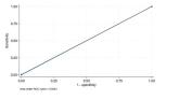
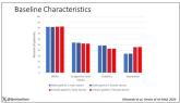
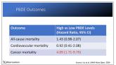
Opinion
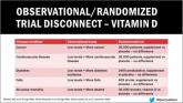
Vitamin D Supplements May Be a Double-Edged Sword
I can tell you that for your “average woman,” vitamin D supplementation likely has no effect on mortality.
Opinion
COVID-19 Is a Very Weird Virus
COVID may cause immune system dysfunction that puts patients at risk for autoimmunity.
News
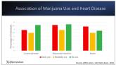
It Sure Looks Like Cannabis Is Bad for the Heart, Doesn’t It?
Dr. Wilson discusses recent research on cannabis and heart disease.
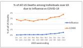
News
Bivalent Vaccines Protect Even Children Who’ve Had COVID
Doctor discusses the progression of understanding of COVID-19 and current vaccines.
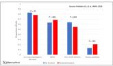
News
More Young Women Being Diagnosed With Breast Cancer Than Ever Before
Rates of breast cancer are up as well as among young women, according to study.
News
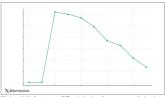
Even Intentional Weight Loss Linked With Cancer
Significant weight loss, even intentionally, can be indicative of cancer.
News
Testosterone Replacement May Cause ... Fracture?
Testosterone replacement linked to possible increased in fractures.
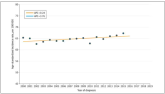
News
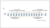
Yes, Patients Are Getting More Complicated
The average hospitalized patient is older, more likely to have kidney disease or diabetes, is on more medications, and has spent more time in the...