Opinion

Spikes out: A COVID mystery
A new study does a great job of...
Opinion
Debating the clinical trial upending colonoscopy practices
“But I feel like this study reinforces my feeling that we ought to be presenting these [options], and not saying one is superior or inferior to...
Opinion
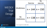
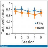
Mindfulness, exercise strike out in memory trial
Meditation and exercise do not appear to be the fountain of youth.
Opinion
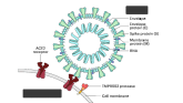
How a cheap liver drug may be the key to preventing COVID
The authors of a paper appearing in Nature give us multiple, complementary lines of evidence.
Opinion
The surprising failure of vitamin D in deficient kids
Having lower levels of vitamin D is not necessarily the thing causing bad outcomes.
Opinion
Love them or hate them, masks in schools work
The confounding here goes in the opposite direction of the results. If anything, these factors should make you more certain that masking works.
Opinion
Ivermectin for COVID-19: Final nail in the coffin
Is this nice U.S. randomized trial enough to convince people that results from a petri dish don’t always transfer to humans, regardless of the...
Opinion
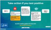
Why the 5-day isolation period for COVID makes no sense
More than half of those positive on day 7 tested positive on day 8, and more than half of those tested positive again on day 9.
Opinion
Why people lie about COVID
Of those surveyed, 41.6% admitted that they lied about COVID or didn’t adhere to COVID guidelines – a conservative estimate, if you ask me.
News

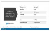
The bionic pancreas triumphs in pivotal trial
When it comes to closed-loops systems for insulin delivery for type 1 diabetes, easier might be better. A new report on such a “bionic pancreas”...
Opinion
Why our brains wear out at the end of the day
Welcome to Impact Factor, your weekly dose of commentary on a new medical study. I’m Dr. F. Perry Wilson of the Yale School of Medicine.
Opinion
Could a common cold virus be causing severe hepatitis in kids?
Dr. Wilson presents hypotheses about what might be going on.
Opinion
Don’t drink calories: Artificial sweeteners beat sugar in new analysis
The effects of drinking low- or zero-calorie drinks instead of sugary ones is modest, but overall beneficial, depending on the outcome you’re...